

للمنتجات اليدوية الأصيلة
منتجات التلي
منتجات الفخار
منتجات النحاس
الأفضل مبيعاً


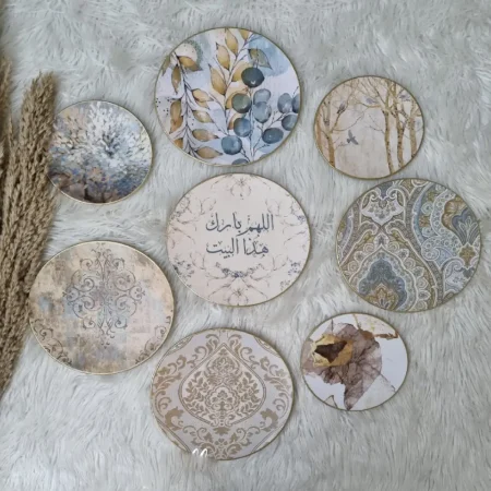
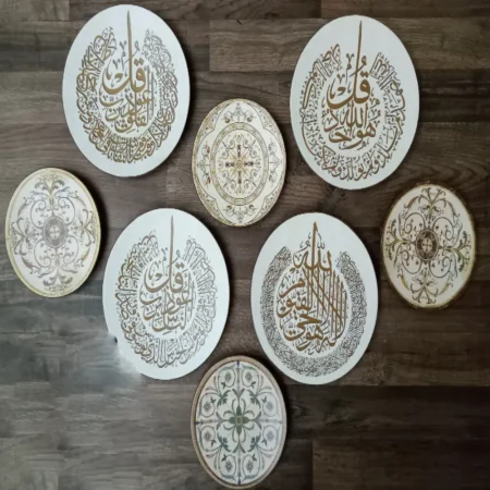
طقم اطباق بورسيلين مزينة بآيات من القرآن بفن الديكوباج للتعليق على الحائط للزينه
تم التقييم 5.00 من 5
EGP1,547.33


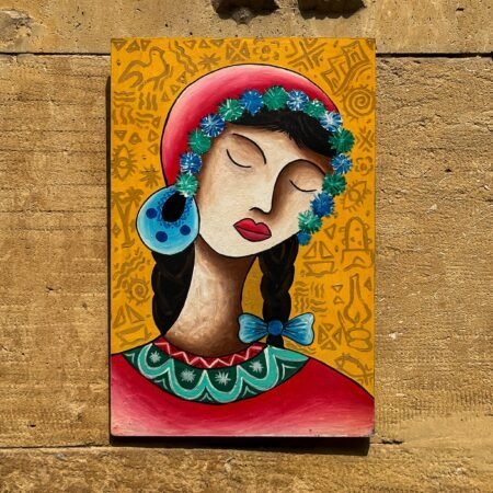
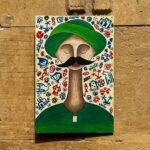
برواز خشب بشخصية فاطمة
EGP800.00

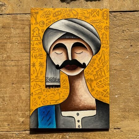
برواز خشب عويس
EGP800.00
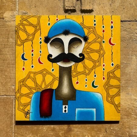
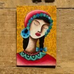
برواز خشب شفيقة
EGP800.00
برواز خشب تيمور
EGP800.00
برواز خشب عتريس
EGP1,200.00
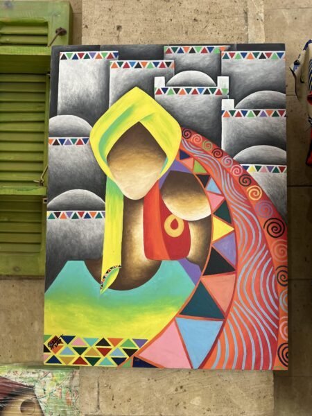
تابلوه خشبي حسن وبهية
EGP3,500.00
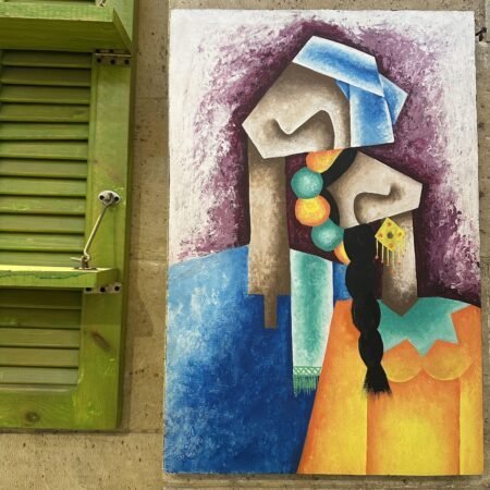
تابلوه خشبي السند
EGP5,000.00
تابلوه وبرواز خشبي احتواء
EGP3,500.00
الأعلى تقييماً
-
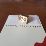
خاتم فرعوني من النحاس EGP350.00
-
مناديل كتب الكتاب مطرزة يدوياً بشكل رائع EGP690.00


أحدث المنتجات
-
برواز خشب بشخصية فاطمة EGP800.00
-
برواز خشب عويس EGP800.00
-
برواز خشب شفيقة EGP800.00
عرض اليوم
-
كاريجان التلي صيفي حريمي مطرز يدويًا بخيوط الفضة
EGP6,500.00السعر الأصلي هو: EGP6,500.00.EGP6,200.00السعر الحالي هو: EGP6,200.00. -
شال التلي حريمي مطرز يدويًا بخيوط الفضة
EGP1,800.00السعر الأصلي هو: EGP1,800.00.EGP1,700.00السعر الحالي هو: EGP1,700.00. -
شمع معطر بتصميم مانديلا لرائحة عطرية جذابة
EGP172.50السعر الأصلي هو: EGP172.50.EGP130.00السعر الحالي هو: EGP130.00.


Latest blog
The freshest and most exciting news